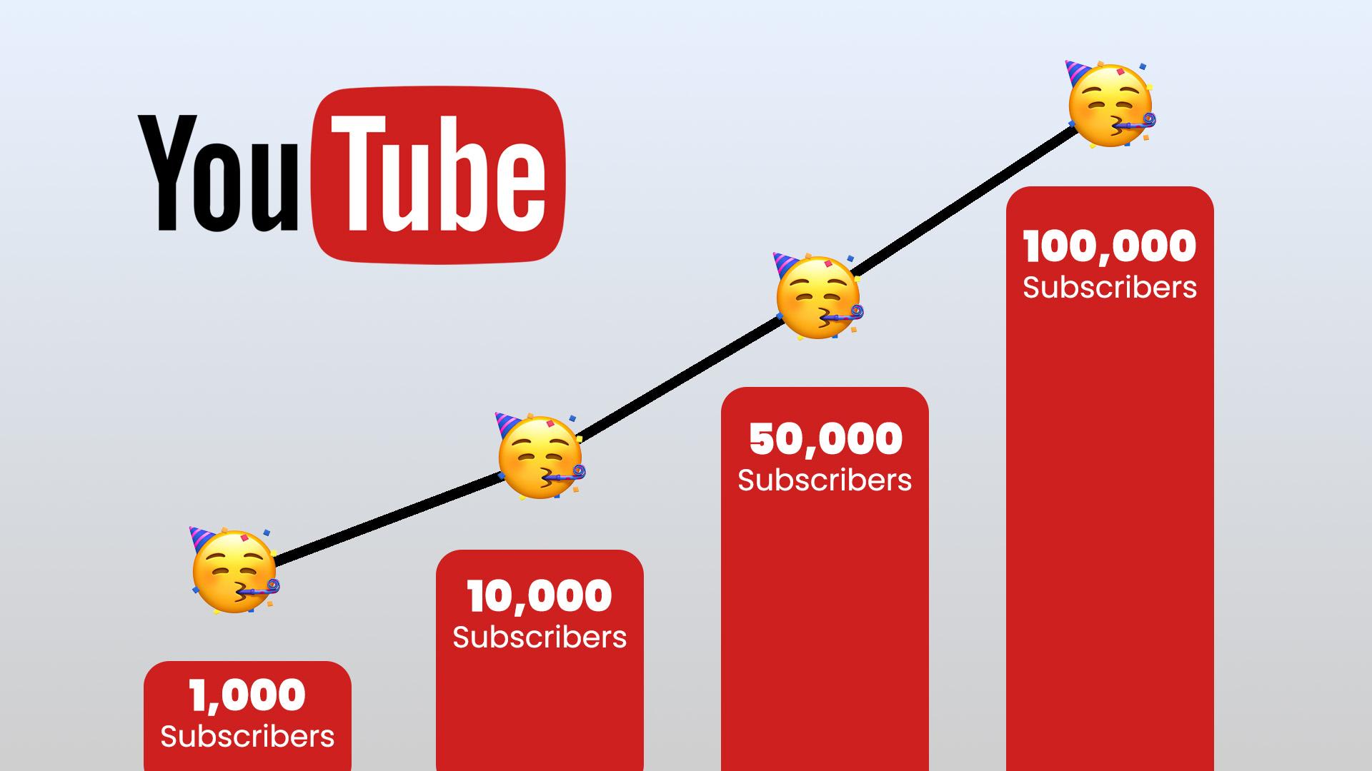
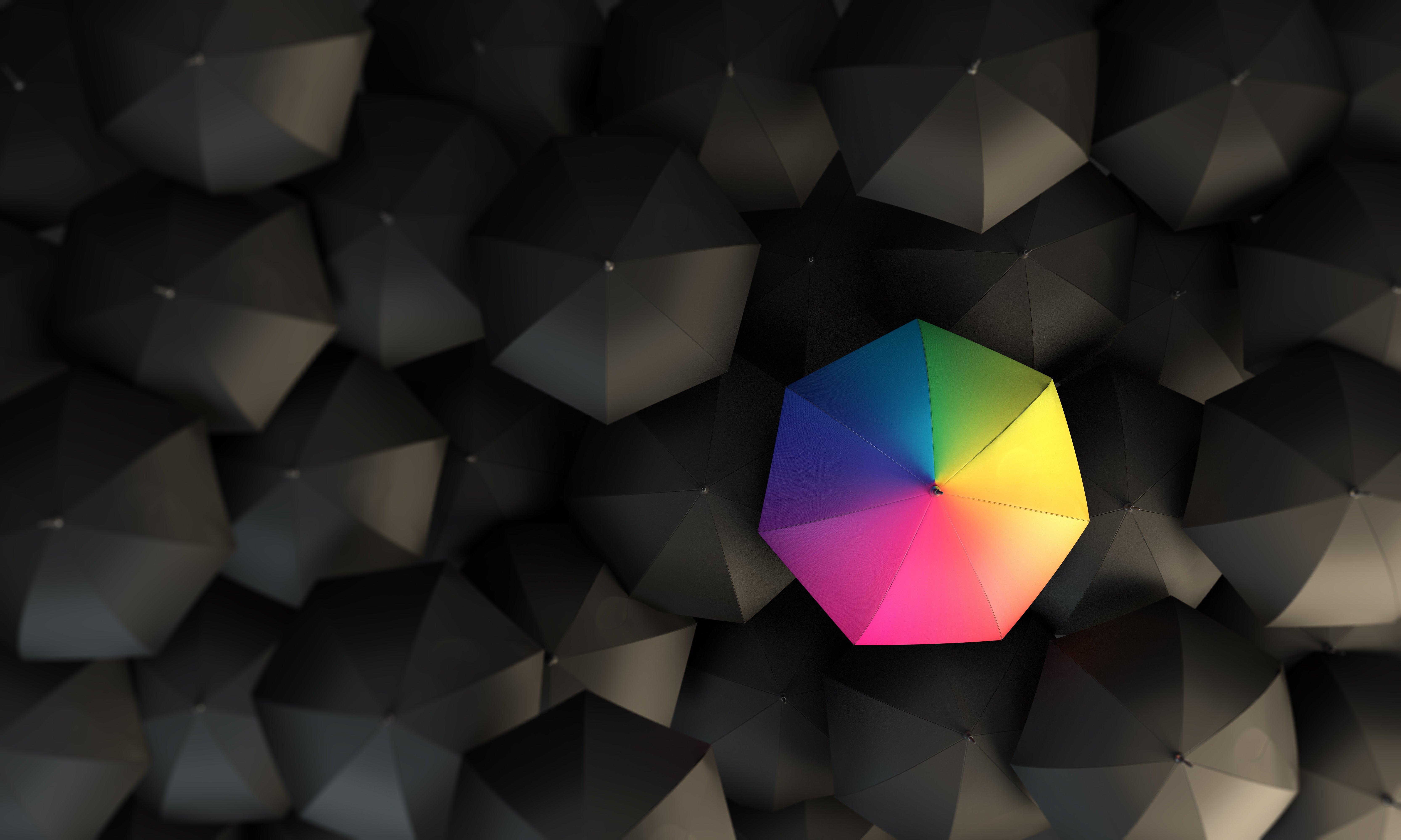
Hey there, fellow creators! If you’ve clicked on this article, you’re probably well aware that a killer thumbnail can make or break your YouTube video. In a sea of content, it’s often the first—and sometimes the only—thing viewers notice. So, how do you make yours pop? One of the not-so-secret ingredients to success is choosing the perfect color mode. Think of color like the seasoning to a great dish; too little, and it falls flat, but too much can be overwhelming.
In this article, we’ll dive into the ins and outs of color modes, exploring how they can help your thumbnails become eye-catching masterpieces. From the bold vibrancy of RGB to the subtle sophistication of CMYK, we’ll break down the options in a way that’s not just informative but also totally approachable. So, grab your creative hat and let’s get started on transforming your thumbnails into scroll-stopping sensations!
Understanding the Psychology Behind Color Choices for Thumbnails
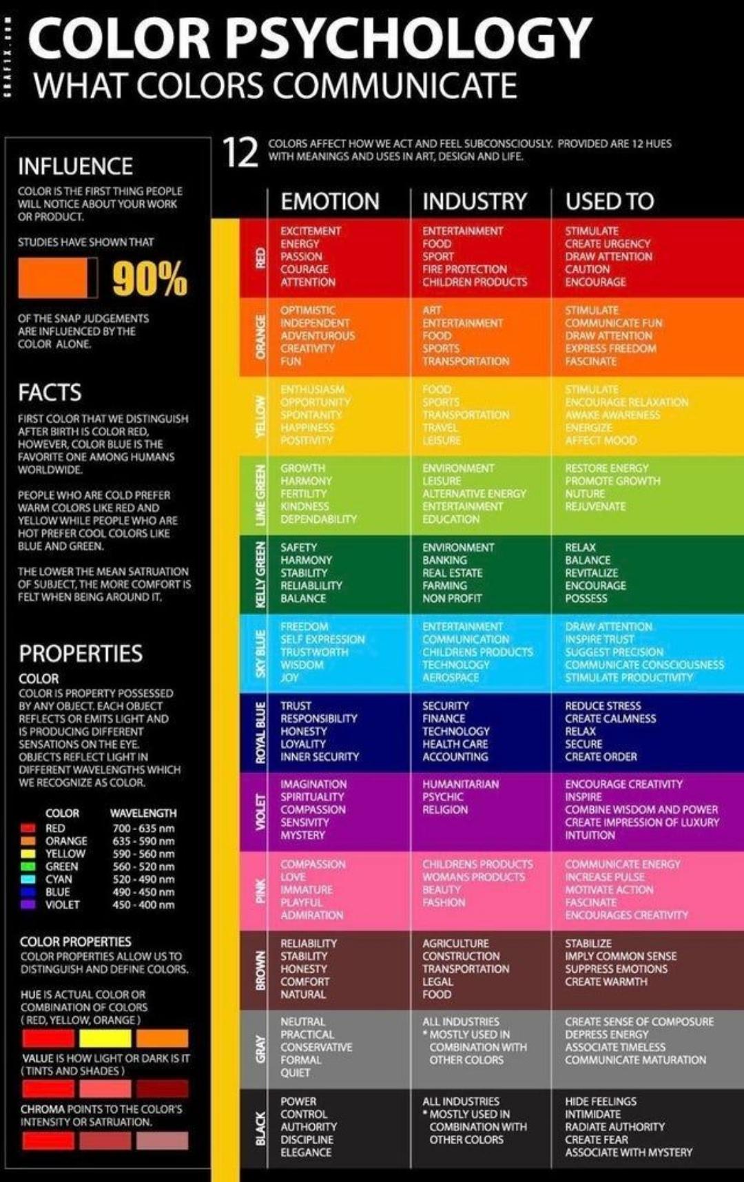
When it comes to picking colors for your YouTube thumbnails, it’s not just a matter of personal preference; it taps deep into psychological responses. Different hues can evoke specific emotions and sensations, drawing viewers in or pushing them away. For instance, red can incite feelings of excitement or urgency, while blue tends to evoke calmness and trust. Think about it: you might scroll past a dull, muted thumbnail without a second glance, but a vibrant pop of color can make your video feel more inviting. This dynamic is all about understanding your audience: what do you want them to feel when they see your content? The right color combo can create a connection before they even hit play.
Moreover, consistency is key. Using a coherent color palette across your thumbnails helps establish brand recognition, making your videos instantly identifiable. Consider forming a color scheme that resonates with your channel’s theme and vibe. For example, if your content is all about adventure, earthy tones like greens and browns paired with bright accents can capture that essence beautifully. A simple table of color meanings may help clarify your choices:
| Color | Emotion |
|---|---|
| Red | Excitement & Urgency |
| Blue | Trust & Calmness |
| Yellow | Happiness & Energy |
| Green | Growth & Balance |
| Purple | Creativity & Luxury |
it’s all about telling a story with color. Each choice you make in your thumbnail isn’t just a stylistic detail but a piece of the puzzle that contributes to your channel’s identity, grabbing attention and igniting curiosity. What will your colors say about you?
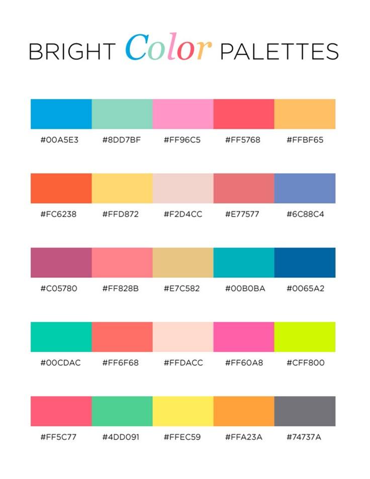
Exploring Vibrant Color Palettes That Grab Attention
When it comes to capturing attention, a vibrant color palette is your secret weapon. Think about the colors you’re drawn to when scrolling through YouTube: bold reds, electric blues, and vibrant yellows can stop users in their tracks. Choosing complementary colors can make your thumbnail not just pop, but leap off the screen! Remember to consider the emotional response colors invoke—warm colors tend to create excitement, while cooler tones can be calming or mysterious. Combine these colors wisely, and you’ve got yourself a visual feast that viewers can’t ignore.
Creating a thumbnail that reflects your video’s vibe is essential. Here are some quick tips to keep in mind:
- Use Contrast: Pair light colors with dark backgrounds for maximum impact.
- Accent Colors: Introduce a splash of a highly contrasting color to emphasize key elements.
- Consistent Branding: Stick to a specific color scheme that aligns with your channel’s personality.
To help visualize your options, check out this handy comparison:
| Color Pairing | Effect |
|---|---|
| Red & Yellow | High Energy |
| Blue & Green | Calming and Trustworthy |
| Purple & Gold | Luxe and Creative |
Experiment with these combinations, and don’t be afraid to let your personality shine through in your color choices. After all, the right colors can make your thumbnails irresistible!
The Impact of Contrast: Making Your Thumbnails Pop
When you’re scrolling through a sea of thumbnails, what grabs your attention first? It’s all about the contrast. Think of contrast as the spark that ignites interest; it sets your content apart from the rest. By utilizing bold colors against complementary backgrounds, you create a visual punch that screams, “Click me!” Consider using a mix of warm tones like reds and oranges against cooler shades like blues and greens. This not only makes your text pop but also adds depth to the overall design. Moreover, high contrast can enhance readability, ensuring your message shines through even on small screens!
To make your thumbnails truly unforgettable, you might also want to explore color psychology. Certain hues evoke specific emotions or reactions, subtly influencing how viewers perceive your video before they even hit play. Here’s a quick breakdown:
| Color | Emotion |
|---|---|
| Red | Excitement, urgency |
| Blue | Trust, calmness |
| Yellow | Optimism, cheerfulness |
| Green | Growth, balance |
| Purple | Creativity, luxury |
By carefully selecting your colors based on the emotions you want to evoke, you can create a thumbnail that not only stands out but also resonates with your audience. Remember, the key is to create a visual hierarchy – make sure your titles and main elements grab attention while supporting the overall theme of your content. So next time you sit down to design a thumbnail, don’t underestimate the power of contrast; that tiny rectangle holds the potential to propel your video to new heights!
Testing and Tweaking: How to Find Your Ideal Color Mode
Finding the right color mode is a bit like picking the perfect outfit—you want something that makes you stand out but feels comfortable at the same time. Start by experimenting with different palettes. Muted tones can create a sophisticated vibe, while vibrant colors grab attention and add energy. If you’re unsure where to start, consider the emotions and feelings you want to evoke! For instance, blues often convey calmness, while reds can signify passion or urgency. Take some time to play around with complementary and contrasting shades. It’s not just about choosing a color; it’s about telling a story that connects with your audience.
Once you’ve settled on a color direction, it’s all about the tweaks. Adjust the brightness, saturation, and contrast to see how they affect your thumbnails in different lighting environments. It’s helpful to review your thumbnails alongside popular videos in your niche. Here’s a simple table to keep track of your preferences:
| Color Mode | Vibe | Best For |
|---|---|---|
| Bold & Bright | Energetic | Action Content |
| Soft Pastels | Calming | DIY & Lifestyle |
| Monochrome | Chic | Fashion & Art |
As you tweak, remember to step back and evaluate. Sometimes, less is more! Share your creations with friends or even a focus group to gain fresh perspectives. If you’re not quite hitting the mark, don’t be afraid to go back to the drawing board. The goal is to make thumbnails that sing with your unique flavor while remaining instantly recognizable to your viewers.
In Retrospect
So there you have it! Choosing the perfect color mode for your YouTube thumbnails isn’t just a technical decision; it’s like choosing the right icing for a cake—no one wants a drab slice when they could have something vibrant and delightful! With the insights from this guide, you’re now equipped to make thumbnails that not only pop but also resonate with your audience. Remember, it’s all about capturing that fleeting moment of attention against a sea of content.
Don’t shy away from experimenting! Dive into those hues, contrast like a pro, and let your creativity run wild. After all, you’re not just creating thumbnails; you’re setting the stage for your video masterpiece. So, go ahead, unleash your inner artist, and watch as your channel blossoms with eye-catching designs that pull viewers in like moths to a flame! And hey, don’t forget to share your favorite color combos or your thumbnail wins in the comments. Until next time, keep creating and keep shining!