You know how they say you never get a second chance to make a first impression? Well, in the world of YouTube, that first impression is your thumbnail! It’s like the cover of a book—if it doesn’t catch the eye, you might as well just throw your video into a black hole. With millions of videos vying for attention, nailing that perfect thumbnail can feel like a daunting task. But fear not! We’re diving deep into the nitty-gritty of YouTube thumbnail dimensions, helping you decode the mystery behind what makes a thumbnail pop. So, grab your creative toolkit and let’s transform your thumbnails from “meh” to “wow!”
Understanding the Ideal Thumbnail Dimensions for Maximum Impact
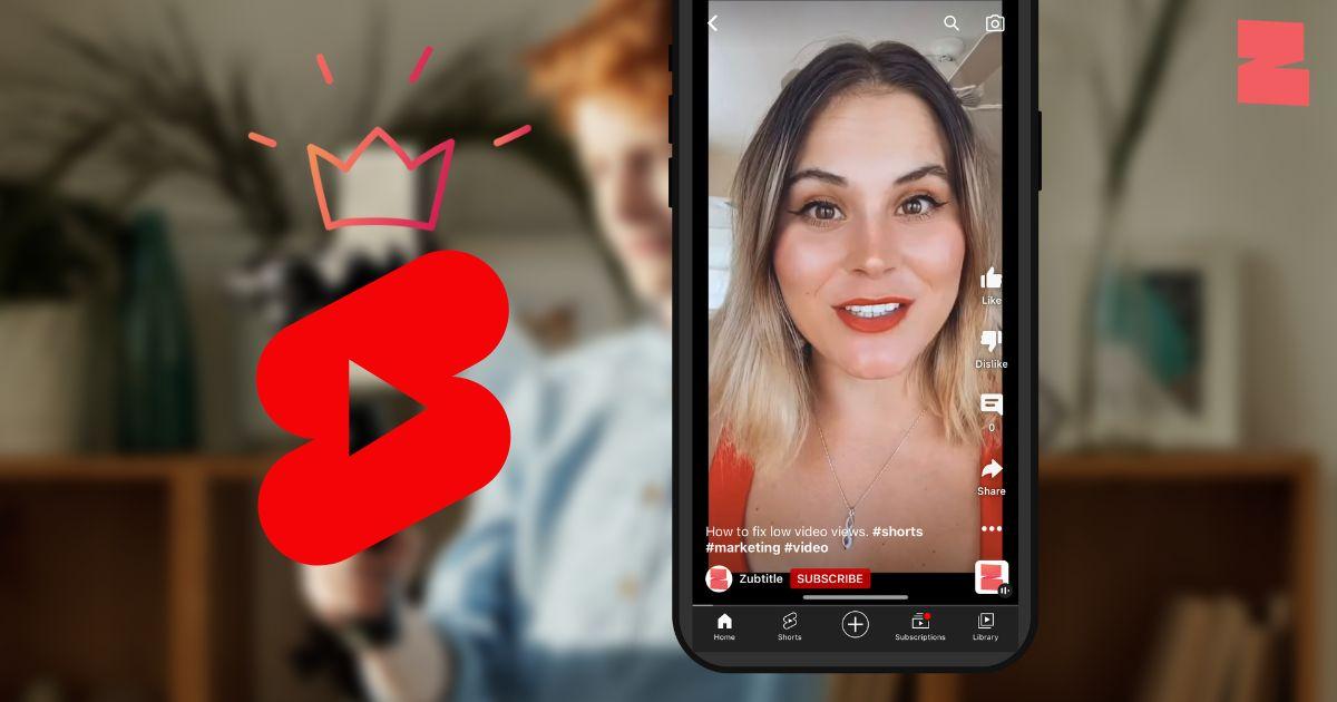
When it comes to YouTube thumbnails, size really does matter! The optimal dimensions to aim for are 1280 x 720 pixels, with a minimum width of 640 pixels. This ensures your thumbnail is displayed perfectly across devices—whether it’s a phone, tablet, or big-screen TV. Think of your thumbnail as a storefront; just like a shop window needs to be inviting and clear, your thumbnail should catch the viewer’s eye and communicate what your video’s all about. You’ve got to ensure it’s under 2MB in size and saved in either JPG, GIF, BMP, or PNG formats.
Now, let’s dive a bit deeper into why these dimensions are essential. A well-crafted thumbnail with the right dimensions looks crisp and professional, which can lead to higher click-through rates (CTR). Remember, about 90% of the most successful videos on YouTube use custom thumbnails rather than automatic stills. It’s like having a secret weapon in your content arsenal! Here’s a quick breakdown of the essential specs to keep in mind:
| Thumbnail Aspect Ratio | Recommended Size |
|---|---|
| 16:9 | 1280 x 720 pixels |
| Minimum Width | 640 pixels |
| Maximum File Size | 2MB |
| Supported Formats | JPG, GIF, BMP, PNG |

Color Psychology: How Choosing the Right Hues Can Make or Break Your Click-Through Rate
Colors are like the secret sauce in your thumbnail recipe; they can either draw viewers in or push them away. Think about it: when you scroll through feeds, what grabs your attention? It’s often the vibrant reds that spark excitement or the calming blues that make you feel relaxed. Each hue evokes specific emotions, and understanding this can significantly boost your click-through rate. For instance, red can create a sense of urgency, making it perfect for limited-time content. Meanwhile, yellow exudes warmth and friendliness, enticing viewers to click and learn more. So, which colors best suit your content’s vibe?
Experimenting with color contrasts is equally crucial. A thumbnail that’s easy on the eyes can stand out amidst a sea of content. Aim for complementary colors, like blue and orange, that pop off the screen. Here’s a little color cheat sheet for you:
| Color | Meaning | Best For |
|---|---|---|
| Red | Excitement, urgency | Sales, promotions |
| Blue | Trust, calmness | Educational, brand reliability |
| Yellow | Cheerfulness, attention | DIY, how-tos |
| Green | Growth, health | Wellness, nature |
Using these insights, you can create thumbnails that resonate with your audience, making them impossible to scroll past. So, why not play around with your palette and see what works? Your click-through rate will thank you!

The Power of Typography: Selecting Fonts That Capture Attention
When it comes to grabbing attention, the right font can be your secret weapon. Consider how bold types can evoke strength while delicate scripts can whisper elegance. Each font tells a story, so choose wisely! Think about your audience and the vibe you want to convey. Are you going for fun and quirky, or serious and professional? Having a clear vision will guide you in picking fonts that not only match your message but pull viewers in like a moth to a flame.
Here’s a quick breakdown to help you nail your font selection:
- Sans-serif: Great for modern, clean designs that pop.
- Serif: Gives a classic, trusted feel—perfect for educational or formal content.
- Display Fonts: Use these to embrace creativity and get noticed!
Don’t forget about sizing and color! A *big*, clear font in a contrasting color can be the difference between a viewer clicking on your thumbnail or scrolling past it. Play around until you find a mix that really makes your text stand out. After all, it’s not just about pretty letters; it’s about crafting a visual hook!

Images That Speak: How to Choose Visuals That Tell Your Story at a Glance
When it comes to crafting a YouTube thumbnail, visuals are your superpower. Think of them as the gateway to your content—an eye-catching thumbnail can draw viewers in like bees to honey. To create a strong first impression, focus on using bold colors and clear imagery that speaks directly to your audience. Mix in elements that set the tone of your video, whether it’s fun, educational, or anything in between. It’s all about creating a visual narrative in a split second. The right combination of images can make your thumbnail pop and entice users to click. Think of it like a book cover; if it’s intriguing, people will want to dive in!
Choosing the right imagery is easier with a little direction. Start with these tips to ensure your visuals resonate:
- Use high-resolution images to avoid pixelation.
- Select recognizable symbols that represent your topic.
- Incorporate contrasting colors for immediate impact.
- Add text sparingly—just enough to complement the image without overwhelming.
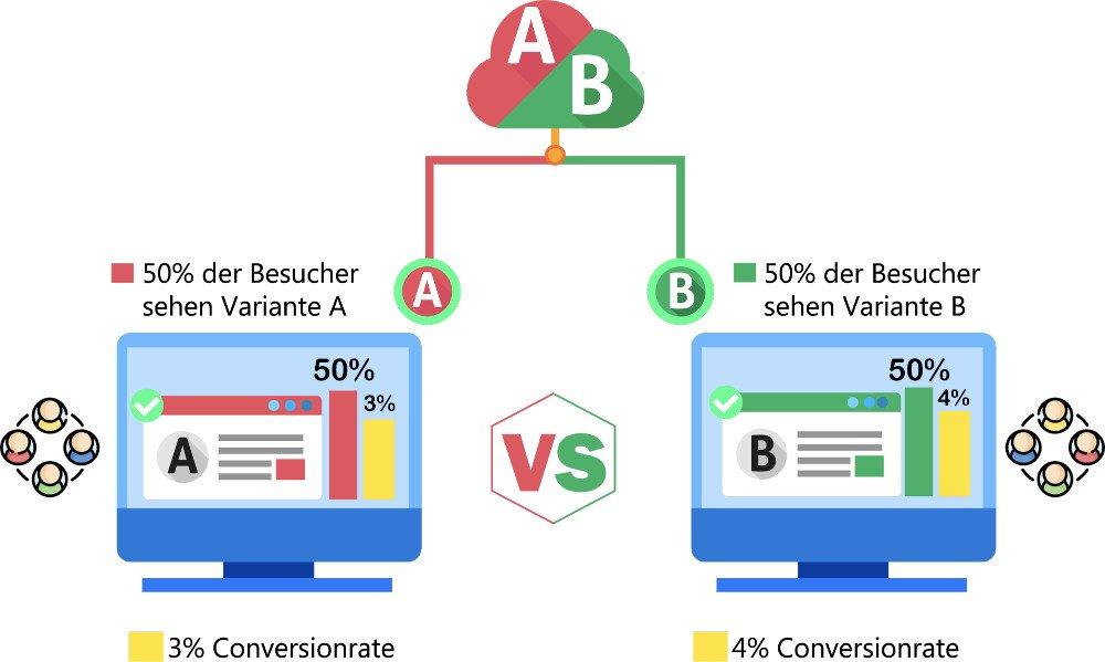
Consider using a table to compare designs or track which thumbnails perform best. A simple layout can help:
| Thumbnail Design | Engagement Rate |
|---|---|
| Bright Colors + Bold Text | 75% |
| Minimalist Vibe | 60% |
| Infographics | 80% |

The Conclusion
And there you have it! Crafting the perfect YouTube thumbnail isn’t just about slapping on a few images and some flashy text; it’s an art form that can make or break your video’s appeal. Think of it as the storefront window of your channel—an inviting glimpse into the treasures waiting inside. You’ve armed yourself with the ideal dimensions, learned some snazzy design tips, and hopefully, you’re feeling pumped to give your thumbnails the glow-up they deserve.
Remember, a killer thumbnail can be that magical key that unlocks the door to your audience’s curiosity. So, go ahead and unleash your creativity! Test out different styles, colors, and images. Don’t hesitate to embrace trial and error—sometimes the best thumbnails come from unexpected places.
Now, get out there, paint your digital canvas, and watch as your click rates soar! When you nail that thumbnail game, you’ll see how a small image can lead to big opportunities. Happy creating! 🎨✨