Ever scrolled through YouTube and found yourself drawn to that one thumbnail that just pops? You know, the one that practically screams, “Click me!”? It’s amazing how much power a catchy thumbnail holds—it’s like the front door of a house: if it’s inviting, people will want to step inside. In the vast ocean of content on YouTube, your thumbnail can be the difference between a sea of views and just drifting into the abyss. So, what’s the real value of that eye-catching image? Let’s dive into the art and science of crafting the perfect thumbnail and uncover what it’s truly worth in the competitive world of online video. Ready to decode the dollar signs behind those captivating visuals? Let’s go!
Crafting Thumbnails That Click: The Art of Eye-Catching Design
In the ever-evolving world of YouTube, your thumbnail is like the shiny wrapper on a candy bar; it’s the first thing viewers see and can be the difference between a click or a scroll. To make your thumbnail pop, consider the power of vivid colors and bold fonts that grab attention and convey your video’s essence at a glance. Aim for simplicity—too much clutter can be overwhelming. Imagine your thumbnail as a movie poster; it should tell a story and spark curiosity. Don’t shy away from using compelling imagery or even a close-up of a facial expression; these can evoke emotions and invite viewers in.
Moreover, strategic placement of text is crucial. Keep it short and snappy—using just a few words can create urgency and interest. Think about incorporating elements like contrast and alignment to guide the viewer’s eye seamlessly. A simple table summarizing the thumbnail elements you might want to consider could look something like this:
| Element | Tip |
|---|---|
| Colors | Use a palette that stands out but is harmonious. |
| Fonts | Play with sizes; keep it readable from a distance. |
| Imagery | Choose high-quality visuals that represent your content. |
| Text Position | Align text in a way that complements the image. |
By taking these aspects into account, you can craft thumbnails that not only attract clicks but also keep viewers engaged with your content. Think of each thumbnail as a mini advertisement for your video—a chance to make a memorable first impression that encapsulates the magic within.
Understanding Viewer Psychology: What Makes a Thumbnail Irresistible
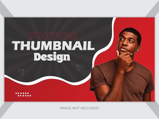
When it comes to crafting a YouTube thumbnail that can stop a viewer mid-scroll, understanding the psychology behind what grabs attention is crucial. Have you ever clicked on a video simply because of a quirky expression on someone’s face or a vibrant burst of color? That’s the magic of visual storytelling! There are a few core elements that make a thumbnail truly pop:
- Bold Colors: Bright and contrasting colors catch the eye, drawing viewers in like moths to a flame.
- Facial Expressions: Emotions resonate; a well-timed smile or look of surprise can create a sense of curiosity.
- Text Clarity: Use short, snappy phrases that are easy to read even at a small size—aim for no more than a few impactful words.
- Brand Consistency: Make sure your thumbnails reflect your channel’s vibe, creating a cohesive brand image that your audience will recognize.
Ultimately, a thumbnail is your first handshake with potential viewers. It needs to exude personality and promise to deliver value in a glance. Think of it as a movie poster—would you buy a ticket to a dull film? Probably not. Keep testing different styles and elements to see what resonates most with your audience. Here’s a quick breakdown of some thumbnail types and their psychology:
| Thumbnail Type | Psychological Effect |
| Close-up Faces | Creates a personal connection, making viewers feel more involved. |
| Action Shots | Conveys excitement and energy, enticing viewers to experience more. |
| Text Overlay | Provides context and teases the content, stoking intrigue. |
Colors, Fonts, and Faces: Key Elements That Boost Your Click-Through Rate
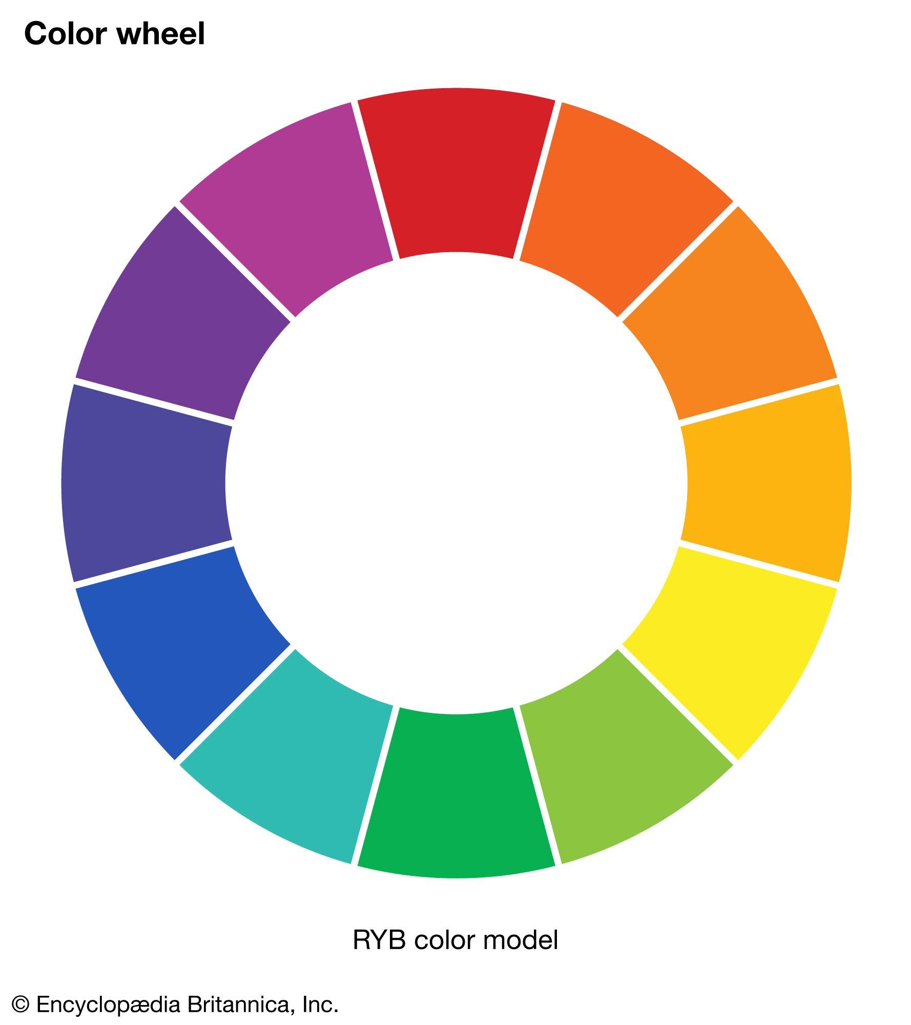
When it comes to designing an eye-catching YouTube thumbnail, the right mix of colors, fonts, and faces can make all the difference in grabbing viewer attention. Think of colors as the mood setters of your thumbnail; vibrant and bold hues can evoke excitement while softer tones might suggest a more laid-back vibe. Use contrasting colors to make key elements pop, ensuring they stand out against the chaotic backdrop typical of YouTube feeds. Think about it—ever clicked on a video because the colors just screamed, “Watch me!”? Exactly. Aim for three main colors to maintain visual coherence without overwhelming your viewers.
Fonts can be the understated heroes of your thumbnail design. A well-chosen font not only conveys your message clearly but also reflects the tone of your content. Opt for bold, sans-serif fonts that are easy to read, even on the tiniest of mobile screens. And let’s not forget the power of faces! Including expressive human faces can create a connection and elicit curiosity. A friendly smile or a look of shock can invoke emotions that encourage clicks. Here’s a quick rundown of what to consider in your design:
| Element | Tip |
|---|---|
| Colors | Use bold contrasts for emphasis. |
| Fonts | Choose readable, striking styles. |
| Faces | Use expressive images to draw viewers in. |
Testing and Tweaking: Strategies for Optimizing Your Thumbnail’s Performance
When it comes to YouTube thumbnails, testing is your best friend. Think of it like a dress rehearsal before the big show; you want everything to shine when the spotlight hits. Start by creating a couple of different designs for the same video and then track how each performs. Use YouTube’s analytics tools to dive into metrics like click-through rate (CTR). You might discover that a vibrant color catches more eyes, or a close-up shot of a person triggers more clicks. Here are some tips to consider while you’re testing:
- Color Contrast: High-contrast colors usually grab attention faster.
- Text Readability: Ensure any text is bold and easy to read, even on small screens.
- Emotional Connection: Images that convey emotion can entice viewers to click.
Once you have a grasp on what works, it’s time to tweak. Small adjustments can lead to major results. Maybe it means shifting the text slightly for better balance, or upgrading the image quality for a sharper look. Don’t shy away from experimenting! A/B testing is a fantastic way to get real-time feedback. For example, create a simple table to compare your thumbnails’ performance:
| Thumbnail Design | CTR | Engagement Rate |
|---|---|---|
| Design A | 7% | 15% |
| Design B | 9% | 20% |
| Design C | 10% | 25% |
This way, you’ll quickly see what resonates with your audience. Remember, tweaking isn’t just about making it pretty; it’s about crafting a thumbnail that speaks to the viewer and drives them to hit that play button!

In Summary
As we wrap up this deep dive into the world of YouTube thumbnails and their dollar signs, it’s clear that these little images pack a punch beyond what meets the eye. Think of your thumbnail as the neon sign outside your favorite diner—it needs to be eye-catching, inviting, and a little quirky to pull in hungry customers. Just like that diner is competing for attention on a bustling street, your content is vying for clicks in a sea of videos.
So, the next time you’re crafting a thumbnail, remember its potential power. It’s not just about looks; it’s a promotional tool that can elevate your content, engage viewers, and yes, boost your revenue. If you’re ready to start analyzing your own thumbnails with an eye towards profitability, get out there and experiment! Test your designs, swap colors, and don’t shy away from bold choices.
After all, the beauty of YouTube is that it’s a continuous learning journey. Every click can inform and refine your approach. Who knows? Your next thumbnail might just be the one that converts views into bucks. Happy thumbnail crafting, and may your click-through rates soar!

