Hey there, fellow creators! So, you’ve probably heard it a million times: “Thumbnails are crucial for your YouTube success.” But let’s be real—most advice out there barely scratches the surface. It’s frustrating, right? You’re spending hours crafting your content, only to have your hard work blend into the cosmic void of the YouTube homepage. Well, worry no more! Today, we’re pulling back the curtain and diving deep into the nitty-gritty of thumbnail creation.
We’ve all been there, scrolling through endless videos, when suddenly, a thumbnail jumps out and grips our attention. That’s no accident! A stellar thumbnail can transform your video from a mere blip to a viral sensation, skyrocketing views from a meager hundred to a jaw-dropping hundred thousand. Remember that video by a creator you follow that sat stagnant for months? One strategic thumbnail makeover later, it’s racking up half a million views—talk about a glow-up!
In this article, we’re not just skimming over basic tips; we’re going full throttle into techniques and tricks that can make your thumbnails pop and perform. Whether you’re just starting or you’re a seasoned pro looking to refresh your skills, we’ve got something for you. So let’s break it down, starting with the essentials of layout. And trust me, by the time we’re done, you’ll be crafting thumbnails that’ll make even the most experienced YouTuber take notice. Ready to transform your click-through rate? Let’s get into it!
Mastering the Layout: Why Simplicity is Key
When it comes to creating YouTube thumbnails, embracing a simple layout is crucial. Think of your thumbnail as a billboard on a busy highway: you want drivers to understand your message at a glance. Avoid clutter like it’s Sunday brunch with too many dishes on the table! The golden rule? Stick to two or three key elements. This could be an eye-catching image, a few bold words, or even your captivating face expressing a strong emotion. Less is more, and letting those elements breathe will help attract viewers instead of driving them away to confusion.
Visual hierarchy plays a key role here, too. Using the rule of thirds can be your best friend when it comes to organizing those essential components. Imagine dividing your thumbnail into a 3×3 grid; you’ll want to position the most important parts where the lines intersect for maximum impact. Always remember that white space is your ally. It makes your thumbnail easy on the eyes and allows your key message to stand out like a diamond in the rough. So, whether you’re crafting a catchy phrase or using a striking image, ensure that everything is neatly laid out without any crowded chaos—your audience will thank you!
Bringing Color to Life: Leveraging Color Theory for Maximum Impact
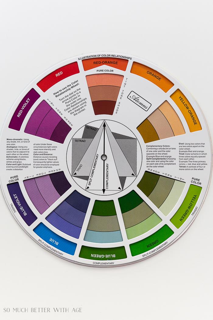
When it comes to YouTube thumbnails, mastering the art of color can make all the difference in grabbing your audience’s attention. Think of color as the emotional brushstroke on your canvas; it’s not just about looking pretty but conjuring up feelings. For example, vibrant reds can evoke urgency or alertness, while cool blues may instill a sense of trust and calm. The beauty of understanding color theory lies in using contrasting colors to really make important elements pop. Why blend in with the crowd of greens in a soccer channel when you can throw in a striking blue? It’s like being that lone sunflower in a field of daisies—impossible to overlook!
But let’s dive deeper—simplifying your design by sticking to two or three elements can be a game changer too! Picture this: a thumbnail that’s overloaded with text and images is like trying to drink from a fire hose; it’s just too much chaos to handle. Instead, using the rule of thirds to position your main elements can effectively guide the viewer’s eye en route to your central message. Remember Ali Abdaal’s thumbnails? They radiate simplicity and respect the viewer’s need for clarity. Essentially, using color strategically alongside a clean layout helps ensure your thumbnails stand out, like the unforgettable first notes of your favorite song. When you meld these elements together, you’re not just creating a thumbnail; you’re telling a story in a single glance!
Crafting Compelling Text: The Art of Curiosity, Clarity, and Complementation
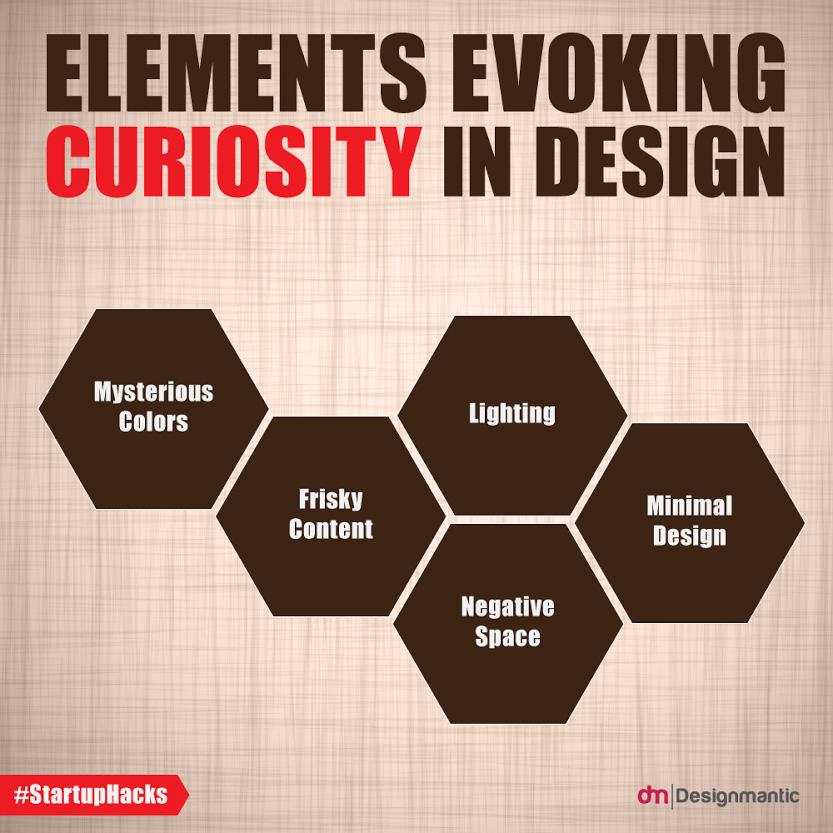
When it comes to designing eye-catching YouTube thumbnails, a bit of finesse goes a long way. Curiosity is your first weapon. Use provocative text that sparks intrigue and compels viewers to click. Think of it as a tantalizing appetizer before a meal; it should make them hungry for more. For example, if your video is about achieving success, instead of just saying “Success Tips,” try something like “I Failed!” This cue not only grabs attention but prompts viewers to think, “Wait, how did they fail? I need to know!” Meanwhile, it’s essential to balance that curiosity with clarity. Your thumbnail shouldn’t feel like a word jumble; aim for a maximum of three words. This keeps the message focused and easy to digest. Less is often more, especially in a crowded space like YouTube, where every pixel counts.
Now, let’s slide into the world of complementation. Your text should seamlessly blend into the overall aesthetic of your thumbnail rather than compete with it. Consider using playful fonts or styles that enhance the visual narrative instead of overshadowing the key components. The layout plays a significant role here. Picture this: if your central image tells part of the story, like a surprised face, and your text is shoved in the corner, it’s missing out on the spotlight. Instead, let your text frame the intrigue, guiding viewers’ eyes naturally across the thumbnail. Additionally, experiment with colors that evoke the right emotions. For instance, a fiery red could spark urgency, while calming greens might draw in the eager peacemaker. Embrace this harmonious dance of text and imagery, and your thumbnails will not only stand out but also resonate deeply, transforming casual viewers into loyal fans.
The Power of Emotion: Using Faces to Draw in Your Audience
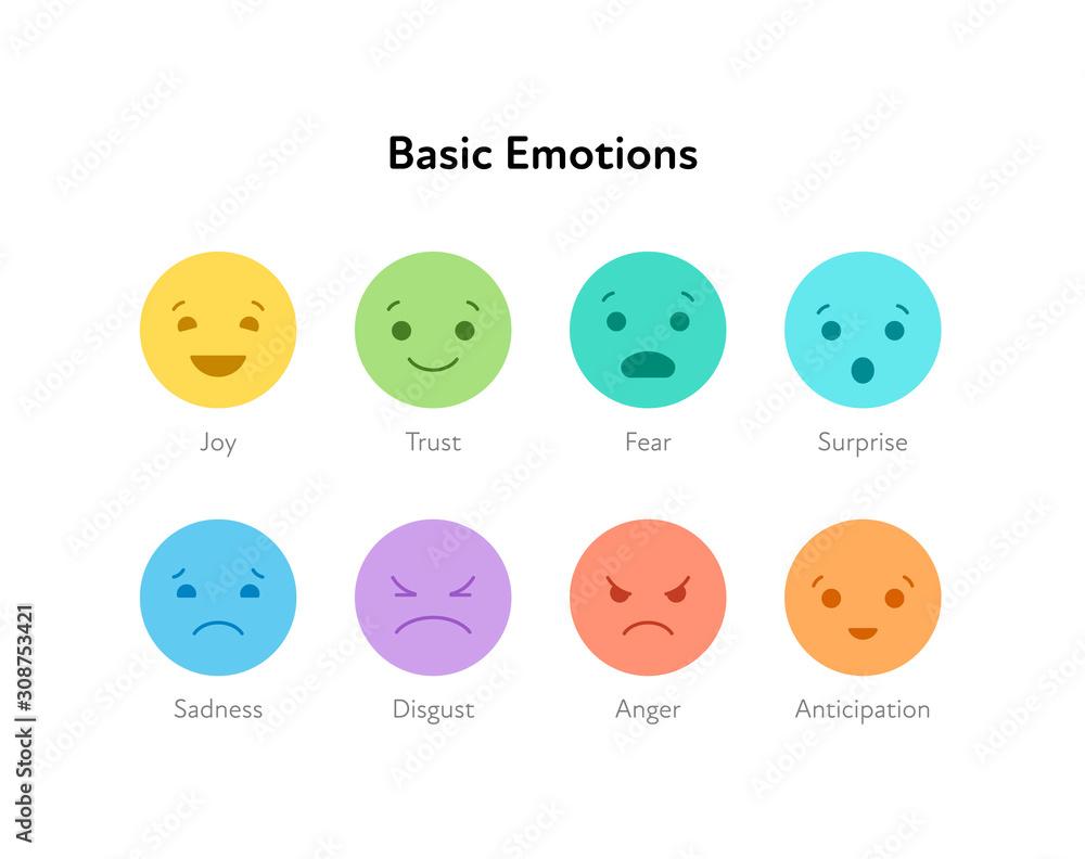
When it comes to grabbing your audience’s attention, nothing beats the impact of a well-crafted facial expression. Think about it: a thumbnail is often the first impression viewers have of your video. It’s your chance to make them stop scrolling and click play. Faces wield a certain magic; they can convey emotion, curiosity, and even humor in just a glance. For instance, a surprised face can evoke a sense of wonder, while an excited smile can spark joy. They don’t just draw the eye; they also trigger the brain to register feelings and act on them—like when you see a friend smiling, and you can’t help but smile back. Who doesn’t want to feel part of that joy or drama? It’s almost like a visual handshake, inviting viewers into the story before the video even starts.
Now, let’s talk strategy: you want to put emotion front and center. The right facial expression can turn a mediocre thumbnail into a click magnet. If you’re on YouTube and scrolling through videos, which ones catch your attention? It’s almost guaranteed that thumbnails featuring exaggerated expressions are the ones that stick in your mind. Think of YouTubers like Mr. Beast who utilize over-the-top reactions—these faces create intrigue and anticipation. In contrast, if the face is too small or hidden away in the corner, its power is lost. Use the rule of thirds to position your subject’s face prominently in the frame, ensuring that it’s large enough to have an impact. Why not test different expressions using the A/B testing tool to see which resonates best with your audience? Trust me, you’ll be amazed at the difference that a single expressive face can make in your thumbnail game!
To Wrap It Up
And there you have it! We’ve peeled back the curtain on creating eye-catching YouTube thumbnails, diving into what truly makes a thumbnail pop, from layout and color choices to the essential elements of text and imagery. Isn’t it wild how a simple graphic can ignite a video’s success and propel it from obscurity to viral status? Just think about it: your thumbnail is your first impression, the enticing bait that lures viewers in. It’s like setting the table before a big feast; if it looks inviting, people are bound to take a seat at your video!
I know, the world of YouTube can feel a bit like swimming upstream, especially with so many creators vying for attention. But now that you have these pro tips under your belt, you’re armed with the knowledge to craft thumbnails that not only look great but also speak the language of your audience. Remember, simplicity is key—too much noise can drown out your message. Keep it fresh, keep it engaging, and most importantly, keep it YOU!
So, what’s next? Grab your design tool of choice and start experimenting with these techniques! And hey, don’t forget to share your creations with us in the comments below; it would be awesome to see how you’re applying what you’ve learned. Until next time, keep filming and keep thriving—let’s make those thumbnails get the attention they deserve! 🌟
