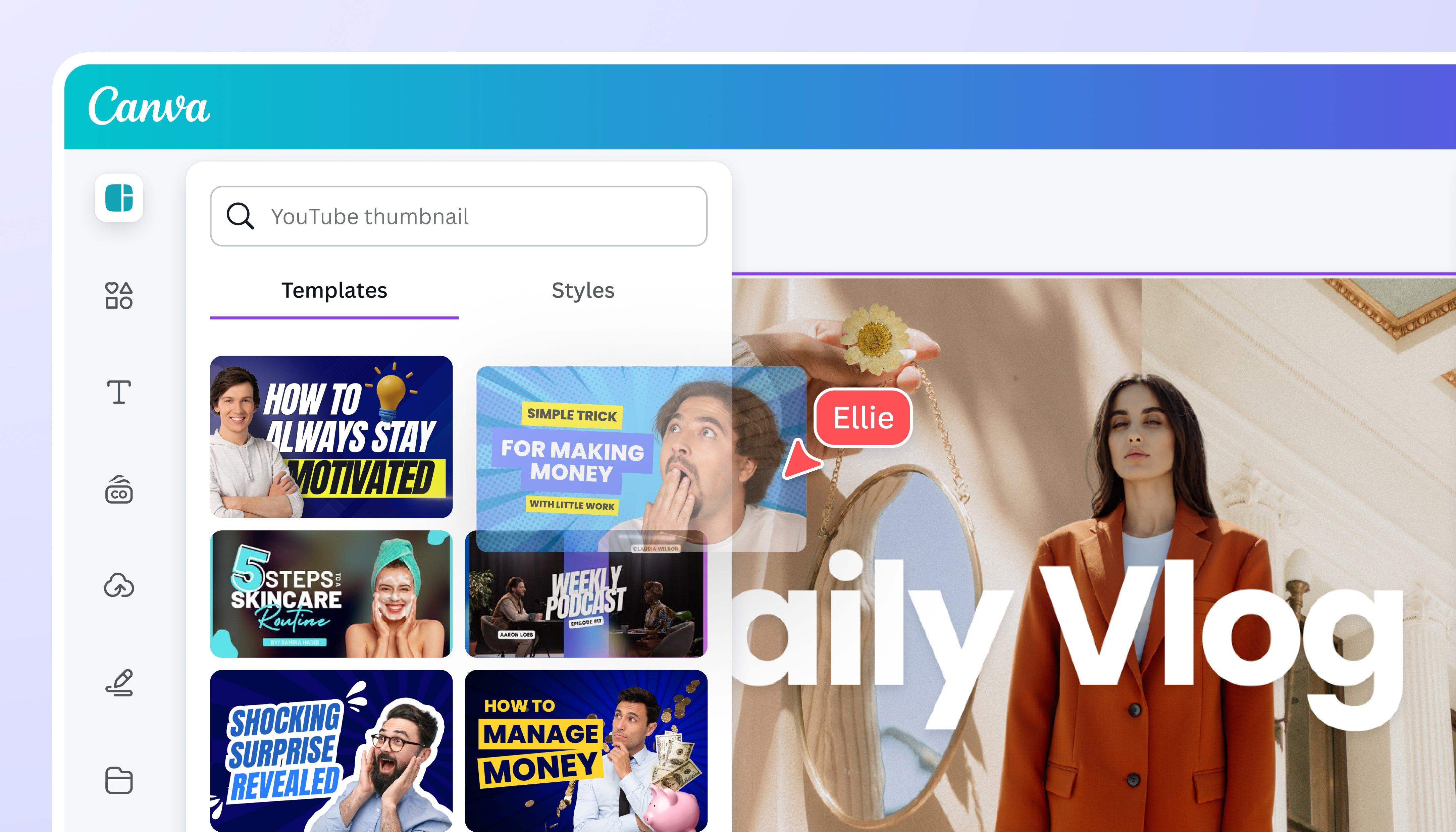
Are you ready to dive deep into the captivating world of YouTube thumbnails? You might think it’s just a small visual element, but trust me, it’s the cherry on top of your digital sundae! When it comes to grabbing attention in the ever-scrolling, fast-paced universe of YouTube, your thumbnail can make or break your content. It’s like the movie trailer for your video—if it doesn’t spark curiosity, viewers won’t even hit “play.” So, in my latest video, I did something pretty cool: I combed through all our live streams to uncover the most burning questions around thumbnails, and I’ve rolled them into a 20-minute masterclass that is packed with golden nuggets of wisdom. Wondering what features make a thumbnail successful? Or how color choices can set the mood? I’ve got you covered with a simple checklist I like to call the “Three C’s” to get that all-important click! So grab a notepad, get comfy, and let’s unlock the secrets of creating thumbnails that don’t just look good but work hard for you too! Ready to level up your thumbnail game? Let’s get started!
Understanding the Essentials of Thumbnail Design
When diving into thumbnail design, it’s all about the essentials. First off, think of the three C’s: Catch the Eye, Convey the Idea, and Create Curiosity. Each of these elements plays a crucial role in whether someone decides to click on your video or scroll past it. To catch someone’s attention, use techniques like contrasting colors, compelling faces, or big, bold text. You can even do what I call the “feed test”—open YouTube, see which thumbnails grab your attention first, and analyze why they worked. Were the colors vibrant? Was there an intriguing expression? Jot down what you find effective, as these insights can enhance your thumbnail strategy enormously. Remember, setting up an expectation with your thumbnail is key; if viewers feel misled in those first few seconds, they might just bounce to the next video.
Another pivotal aspect is color choice. Experiment with different combinations—like black and yellow or the classic blue and white. There’s no one-size-fits-all answer here, but observing what works for your niche can guide you. When it comes to text, keeping it concise is crucial; viewers typically only invest a fleeting moment in each thumbnail before moving on. White or yellow text on a contrasting background tends to perform well; you can enhance visibility with drop shadows or outlines. Don’t worry too much about getting everything perfect on the first go; think of your thumbnails as a canvas for creativity. Just keep refining and you’ll see growth in those click-through rates.

Crafting Thumbnails That Capture Attention
When it comes to creating eye-catching thumbnails, there are a few crucial features you absolutely can’t overlook. Picture this: you’re scrolling through a sea of videos and one particular thumbnail just yells, “Click me!” What makes that happen? It boils down to three key elements I like to call the three C’s: Catch the Eye, Convey the Idea, and Create Curiosity. It’s like trying to lure in a fish; you need the shiny bait! For instance, using bright colors or bold text can make all the difference in grabbing attention. So, next time you’re designing, think of your thumbnail as your storefront – if it looks dull, who’s going to stop and look around?
Now let’s sprinkle in some color talk, shall we? There’s no one-size-fits-all answer to the “best color” question. However, some combinations just pop! Think black and yellow or blue and orange – those work like a charm for many channels! You want your text to stand out against your background, right? A white text with a drop shadow can do wonders, especially on a colorful background. It’s all about finding that perfect contrast that makes your thumbnail not just readable, but irresistible. Get creative with it, keep experimenting, and soon enough, you’ll be crafting thumbnails that don’t just catch attention but also get those clicks!
The Art of Creating Curiosity in Your Thumbnails
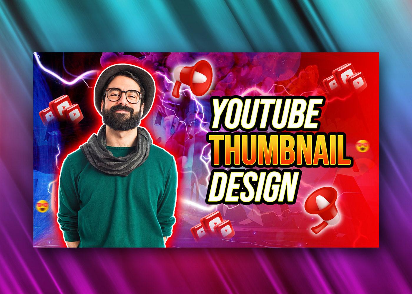
Creating a thumbnail that sparks curiosity is like crafting the perfect hook in a story; it pulls people in while leaving them eager for more. To get that click, focus on the three C’s: Catch the Eye, Convey the Idea, and most importantly, Create Curiosity. Now, if you want your thumbnail to shine, play around with bold colors and captivating images. For instance, perform a feed test—open up YouTube and see which thumbnail instantly grabs your attention. Is it the striking contrast of colors? The allure of a familiar face? Use those insights to design thumbnails that not only beg to be clicked but also align with your video’s content. If the thumbnail doesn’t represent what viewers can expect, they’re likely to bounce to the next option. In a nutshell, you’ve got to set the stage right from the get-go!
Text can be a useful ally in your thumbnail arsenal, but how do you find the sweet spot? Aim for simplicity—your text should be legible at a glance, ideally sticking to one to three impactful words. Think of it as a billboard on the highway; if it’s cluttered, you’ll zoom right past it. Choose bold sans-serif fonts that stand out against any background, and if you’re in doubt, a drop shadow or outline can make your text pop even more. Remember to experiment with colors; a classic combo like white on dark or yellow on black tends to work wonders. Ultimately, know your audience and what resonates with them—after all, a thumbnail isn’t just a picture; it’s your chance to create a connection and ignite curiosity. 🎨✨

Mastering Color and Text for Maximum Impact
Creating breathtaking thumbnails is all about mastering color and text—they’re your trusty sidekicks that will give your video that extra oomph. Imagine your thumbnail as a billboard—what gets your potential viewers to stop scrolling and click? First up, consider the three C’s: catch the eye, convey the idea, and create curiosity. Bright colors can pop against the usual feed; think of a vibrant green in a stream of muted thumbnails. Don’t forget styles that spark interest by using the right focal points or materials. When brainstorming your designs, keep in mind that the initial impression matters. If your thumbnail doesn’t align with what’s happening in the video, just like a bad first date, viewers will bounce faster than they can say “next!”
Now, onto text—it’s not just a random collection of letters; it’s another powerful tool in your design toolbox. Stick to simple, bold fonts that grab attention. Popular options like Roboto or Poppins do wonders when sized up. Here’s a pro tip: white text can work miracles, but watch your background! In cases of warping or distracting backgrounds, a contrasting box can anchor your message. Keep it short; a couple of words are much easier to digest than a wall of text. So, how can you combine color and text? It’s all about creating a harmonious blend that’s both engaging and legible. Let your creativity take the lead, and your thumbnails will become irresistible invitations to click!
Closing Remarks
And there you have it, folks! We’ve just wrapped up our whirlwind tour through the ins and outs of thumbnail design based on the fabulous insights from the video, “.” Just think about it—those tiny squares hold so much power over whether someone clicks or scrolls on by. Catching the eye, conveying your video’s message, and crafting a sense of curiosity? Those are the golden rules of thumbnail success, and how cool is it that a quick checklist can keep you on track?
As you step away today, remember those handy pro tips—like the feed test and those trusty color combos—can take your thumbnails from ‘meh’ to ‘must-click.’ Who knew a little color theory could be your secret weapon? And hey, don’t forget about the text! A few punchy words can work wonders, but make sure they’re bold enough to grab attention.
So, whether you’re a budding creator or a seasoned pro, I hope you found some gems in today’s discussion. Go on, put those ideas into practice, and watch your thumbnails shine. And if you have more questions or want to share your thumbnail triumphs, drop a comment below! I’d love to hear from you. Until next time, keep creating and capturing those clicks! Happy thumbnailing! 🖼️✨
