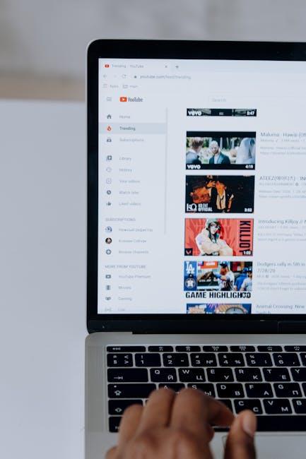
Ever clicked on a video just because the thumbnail caught your eye? Of course, you have! Thumbnails are like the charming shopfronts of the YouTube world, enticing you to step inside and explore. In a sea of countless creators, having a standout thumbnail can be the difference between a video that flops and one that skyrockets to viral status. It’s not just about looking pretty; it’s about fitting your content like a glove, ensuring it accurately represents what viewers can expect. So, whether you’re a newbie or a seasoned pro looking to polish your skills, let’s dive in and uncover the secrets to mastering YouTube thumbnails that not only attract clicks but keep your audience coming back for more!
Crafting Eye-Catching Colors to Hook Your Audience

When you’re designing a thumbnail, colors are your secret weapon. It’s like setting the stage for a magician’s trick; the right colors draw people in, making them eager to see what’s hidden behind that enticing image. Think bold and bright—colors that pop off the screen and make viewers stop scrolling. You want to create a visual feast that not only reflects the theme of your video but also resonates emotionally with your audience. Remember, contrasting colors can generate energy and excitement, while softer shades can convey calm and simplicity. Here’s a quick guide to what different colors can evoke:
- Red: Passion, intensity, urgency
- Blue: Trust, calmness, reliability
- Green: Nature, growth, balance
- Yellow: Optimism, happiness, creativity
- Purple: Luxury, mystery, inspiration
But don’t just throw colors together and hope for the best. A well-crafted color palette tells a story that aligns with your content. Think of it like picking an outfit for a party; every piece should harmonize to present the best version of you. Use tools like color wheel generators to find complimentary colors or create visual hierarchy within your thumbnail. For example, a three-color scheme often works wonders, helping to direct the viewer’s focus effortlessly, keeping their eyes dancing across your design. Remember, simplicity is key; complicated designs can muddle your message. Here’s a simple comparison of color schemes that pack a punch:
| Color Scheme | Effect |
|---|---|
| Monochromatic | Creates harmony, works well for minimalist designs |
| Analogous | Feels cohesive, ideal for creating serene visuals |
| Complementary | High contrast, generates excitement and dynamic visuals |
The Art of Simplicity: Clarity Over Clutter

When it comes to YouTube thumbnails, less really is more. You want your thumbnail to grab attention but not overwhelm viewers with chaos. Think of it like a storefront window: if it’s cluttered, potential customers will walk right past. Instead, focus on a few key elements that pop. Use bold colors, big fonts, and a striking image that represents your content. Keep the design crisp and clear so that even a quick glance can convey what your video is all about. Remember, your thumbnail should tell a story in a single frame—it’s your chance to deliver a knockout punch without saying a word.
To achieve that clarity, consider these essential tips:
- Limit Text: Choose short phrases or catchy titles that summarize your video.
- High Contrast: Use contrasting colors to make text and images stand out.
- Consistent Branding: Stick to your brand colors and fonts for easy recognition.
Here’s a quick reference to fine-tune your thumbnail game:
| Element | Tip |
|---|---|
| Font Size | Large enough to read on mobile |
| Images | Use high-resolution & relevant visuals |
| Call to Action | Encourage clicks with intriguing phrases |
Crafting a striking thumbnail is all about striking the right balance. With the right approach, you can create a thumbnail that not only attracts clicks but also resonates with your audience. Remember, clarity above all else!
Fonts That Speak: Finding the Perfect Typeface

Choosing the right font for your YouTube thumbnails is like picking the perfect outfit for a job interview—it sets the first impression. You want something that doesn’t just look good but also resonates with your channel’s vibe. A bold, sans-serif font can scream confidence and modernity, while a whimsical script font might be more suited for a fun, lifestyle channel. Think about your audience; do they prefer elegance or playfulness? Consider these key points when making your decision:
- Readability: Ensure that your font is clear even when scaled down.
- Personality: Match the font style with your channel’s theme.
- Contrast: Use contrasting colors to make the text pop against the background.
It might be helpful to test a few different typefaces before settling on one. Create a side-by-side comparison to see which font captures attention most effectively. You can even use trusty tools like Canva or Adobe Spark to easily visualize your text options against your thumbnail design. Here’s a quick look at some popular font options:
| Font Style | Best For |
|---|---|
| Impact | Attention-grabbing headlines |
| Lobster | Casual, lifestyle content |
| Roboto | Modern tech videos |
Testing for Success: Optimizing Thumbnails for Maximum Clicks

Creating a thumbnail that grabs attention is like finding the perfect key for a lock; it needs to fit just right. Think of your thumbnail as the front door to your content. If it looks inviting and intriguing, viewers are more likely to knock. Aim for vibrant colors, bold typography, and clear imagery to make your thumbnail stand out. Add catchy text that hints at the value inside your video, but keep it concise. People scroll quickly, so you want something that makes them stop and say, “Wow, that looks interesting!”
Another vital aspect is A/B testing your thumbnails. This isn’t just a one-and-done deal; it’s about trial and error until you find the sweet spot. Create two versions and run them side-by-side—you’ll want to keep an eye on which one gets the most clicks. Analyze the results and gather insights. Here’s a quick look at what you might include in your A/B testing table:
| Thumbnail Design | Click-Through Rate (CTR) | Audience Feedback |
|---|---|---|
| Bright Colors, Bold Text | 12% | “Popped out at me!” |
| Dark Background, Subtle Fonts | 5% | “Too hard to read.” |
In Summary
And there you have it! Crafting those eye-catching YouTube thumbnails is like tailoring a suit that fits you just right—nailing the perfect blend of style and substance. When each thumbnail reflects your unique vibe, you’re not just attracting clicks; you’re inviting viewers into your world. Remember, it’s all about standing out in that crowded video landscape like a bright sunflower in a field of daisies! Don’t be afraid to experiment and evolve; your next masterpiece is just a few pixels away. So go ahead, put your newfound skills into action, and watch your channel bloom! Keep creating, keep growing, and always make sure your thumbnails fit like a glove. Happy filming!