Are your YouTube views feeling a bit lackluster? You’re not alone! If your videos are like hidden gems buried under a mountain of thumbnails, you might be staring at the screen with a furrowed brow and a sigh, wondering why no one’s clicking on your masterpiece. Let’s be honest: those tiny images are your video’s first impression, and in the vast sea of content, they can make or break your success. Think of your thumbnail as the intriguing cover of a book—it needs to lure readers in and inspire them to dig deeper! So, what’s the secret sauce for crafting clickable thumbnails that shout, “Hey, watch me!”? Buckle up, because we’re about to unlock the secrets that’ll transform your thumbnails from “meh” to magnetic. Get ready to skyrocket those clicks and watch your audience grow before your very eyes!
The Art of Eye-Catching Thumbnails That Grab Attention
Creating thumbnails that genuinely stand out can feel like trying to find a needle in a haystack, but it doesn’t have to be that way. Imagine scrolling through your feed: so many videos, yet some just pop! What’s the secret sauce? Well, color, contrast, and clarity are your best buddies here. A vivid background paired with bold text can catch the eye faster than a slice of pizza at a party. Use high-quality images that scream your video’s theme and don’t shy away from including faces—they add a touch of emotion that connects with viewers. After all, who wouldn’t click on a smiling face holding their favorite gadget?
Don’t forget about the power of storytelling in your thumbnails! Think of them as tiny billboards: they should tell a story and spark curiosity. Aim for intriguing visuals that prompt viewers to ask questions—if your thumbnail shows someone puzzled next to a gadget, they’re probably going to click to uncover the mystery. Consider mixing symbols and text to deliver a punchy message quickly. A few key elements can make all the difference, such as:
- Contrasting Colors
- Unique Fonts
- Compelling Images
By mastering these elements, your thumbnails will no longer be overlooked; they’ll be the first thing viewers can’t resist clicking on!
Decoding the Psychology Behind Click-Through Rates
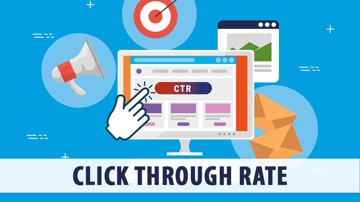
When it comes to YouTube, click-through rates (CTR) can feel like the holy grail of content creation. But what really makes someone click on your thumbnail? Think of it this way: your thumbnail is like a first date. You want it to be intriguing and inviting enough that people want to get to know you better. An eye-catching thumbnail can work wonders by utilizing bold colors, appealing text, and a hint of intrigue—kind of like a cliffhanger in a book that leaves you wanting more. However, it’s not just about looking pretty; context matters. Pairing your thumbnail with an engaging title plays a crucial role, combining visual appeal with promises of valuable content. The potential viewer craves relevance, with a sprinkle of curiosity sparking that initial click.
But let’s not forget the psychological twist behind decision-making! Humans are inherently social creatures, and we’re often conditioned to respond to cues that suggest popularity or approval. This is where elements like faces, expressions, and even color psychology come into play. Thumbnails featuring expressive faces can evoke empathy or curiosity, while using bright colors can elicit excitement. It’s almost like playing puppeteer with the audience’s emotions! Always keep in mind these pivotal factors that influence your CTR:
- Emotional appeal: Create a connection.
- Clarity: Let them know what to expect.
- Unique elements: Stand out from the crowd.
| Strategy | Impact |
|---|---|
| Using faces in thumbnails | Increases relatability and engagement |
| Incorporating vibrant colors | Draws attention and sparks interest |
| Adding curious phrases | Encourages viewers to click for more |
Navigating Trends: What Works in Thumbnails Today
When it comes to crafting the perfect thumbnail, the aim is to grab attention faster than a cat chasing a laser pointer. Bold colors and contrasting elements can do wonders, creating a visual pop that draws viewers in. Think of your thumbnail as the candy wrapper: it has to look good enough to make someone want to take a bite! Experimentation is key here. Try stacking images, using text overlays, or incorporating your brand colors in unexpected ways. Don’t forget—the right images can convey the essence of your video in a heartbeat.
Let’s not forget the power of personality. Thumbnails with faces often perform better; they connect with viewers on a personal level. Incorporating emotions can evoke curiosity, making people wonder what’s going on in the video. Remember, smaller details matter, too. Consider these elements when designing your thumbnails:
- Clarity: Is the text readable at a glance?
- Relevance: Does the image accurately represent the content?
- Timeliness: Is your design trendy, reflecting current styles?
A well-designed thumbnail is like a good book cover; it speaks volumes even before you dive in.
A/B Testing Your Thumbnails: The Key to Unlocking Engagement

Ever felt that rush of excitement when you hit “Publish,” only to notice your thumbnail isn’t getting the clicks you’d hoped for? A/B testing your thumbnails can be a game-changer! Rather than settling for one design, why not experiment like you’re a kid in a candy store? You can create two versions of your thumbnail—say, one with bright colors and bold text and another with a more minimalist approach. By presenting them to different audiences (YouTube offers a way to split your viewers), you can quickly gauge which style captivates the most eyes. Think of it as a mini competition; just like how some people prefer a cozy coffee shop, while others are drawn to vibrant cafés. The same goes for your thumbnails. Understanding what resonates with your audience can unlock that elusive engagement door!
Here’s where the magic happens: use data to refine your designs. After running your A/B tests, take a look at the results and see what made one thumbnail outperform the other. Was it the image? The color palette? Or maybe the font? Create a checklist to assess key elements such as:
- Color scheme
- Text size and style
- Imagery type (illustrative or photographic)
- Emotional appeal
Once you gather all this feedback, you can fine-tune your approach and start churning out thumbnails that don’t just sit pretty but *actually* draw people in. For example, if your A/B testing reveals that a quirky graphic of a cat with vibrant text steals the show, you might want to lean towards that style in future thumbnails. So, embrace the experimenting! Your clicks and views will thank you as your channel transforms into a visual feast.
In Conclusion
And there you have it, folks! If you’ve found yourself stuck in the endless scroll of YouTube thumbnails, it’s time to break free and explore all those hidden gems waiting for you. Remember, a captivating thumbnail is like a well-lit storefront – it catches your eye and invites you in. So, why not give your content the glow-up it deserves?
As you venture into the exciting world of video creation, keep experimenting with those elements we talked about. Whether it’s a striking image, bold text, or a touch of humor, ensure your thumbnails reflect the heart and soul of your videos. Who doesn’t love a good teaser, right?
Before you know it, you’ll not only be attracting viewers but also building a loyal community eager to click on your next upload. So jump in, get creative, and watch as your thumbnails transform from “meh” to mesmerizing! Thanks for hanging out with us today, and happy creating! 🎥✨